Fun pieces of functionality are built into your website from heading tags to accordions. When using these extra items, keep in mind your content needs to be readable and easily understood by the viewer. Below are a few tips on organizing your web content.
One way to think about your page of content is like an ice cream sundae. You can build your page just like you’d build your favorite sundae.
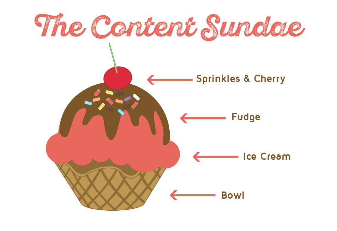
The Bowl – Page/Post
Picture the bowl of your sundae as the page or post your content is sitting on. Everything else is going to start stacking on top of it.
The Ice Cream – Paragraph Text
The ice cream is the base of your sundae; just like content is the base of your page. This should take up the most real estate of your page. You want your content to be readable and understandable. Regular paragraph text does just this. It may seem like “vanilla” and a little boring but this is what a majority of your page should be. Everything else is there to accent and support your content.
One thing to keep in mind is that not everything on your page is incredibly important. You want to lead your viewer’s eye across the page. Putting everything in bold, italics, or underlines doesn’t do that. It is distracting. Think of these like chocolate chips or cookie dough pieces in your ice cream. They are little tidbits sprinkled here and there to access certain pieces.
The Fudge – Supporting Images or Accordions/Tabs
Picture the fudge (or caramel or marshmallow) as the bigger accent pieces on your page, such as images or accordions. You don’t want to flood your page with them as then the main content gets lost. You want to make sure that they are there to support the main points. These pieces are a little bit larger and they take up real estate on your page. They should be used only when necessary, especially the accordions. These should be used for content that it is okay for a viewer to discover later or not at all if it doesn’t apply specifically to them.
Note about accordions: Google indexes the content within accordions but it ranks it lower. Make sure that you have highly valuable content outside of the accordions. Learn more about accordions in our How to Use Accordions post.
The Sprinkles and Cherry – Styling Elements
The sprinkles and cherry are the fun pieces. This is your heading tags, blockquotes, and buttons. They help make your page “pretty” while leading a viewer where to look and read.
Heading tags
Use these to separate sections of content. Like the title says, they should be used for headings, not large chunks of text. Heading tags can be very difficult to read in anything larger than a sentence (a short sentence).
Be sure to use these consistently throughout your website. This means important headings, such as main section titles, should be in a Heading 2 tag. Titles within the Heading 2 section should be in a Heading 3 tag. This flow should be followed on all of your pages so no matter what page a person is reading. The structure always remains the same throughout your whole website.
For more tips on how to use heading tags, check out our Formatting Content post.
Blockquotes
We recommend using these only once or twice (if absolutely needed) on a page. They should be used to pull out an interesting stat/fact or a quote from somebody. These are generally styled in an eye-catching manner, which is why they should be used sparingly. Too many of them the page becomes too distracting to read.
Buttons
Buttons are used to link out to another page or document. Not every link on your page needs to be placed inside of a button. They should be used as a “call to action” where you want to make sure a viewer clicks.
Links
Links should only be the set link color or in a button. Putting a link in a heading tag or changing the color will be confusing. These should all be consistent so a viewer automatically knows when they see text of a certain color and style that it is a clickable link.
Colors
While you have the ability to change the color of the text, we highly recommend keeping this to a rare occasion. Try and keep all the heading tags and links set to the colors already styled into your site. It is possible, once in a while, that you may want to highlight a word or phrase in the middle of a paragraph. This would be a good solution to that, but remember that it should only be done if absolutely necessary.
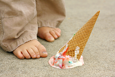 Don’t turn your sundae into mush
If you go to Dairy Queen and order a banana split once a month, they will pretty much all be the same. Each time you order one you will get a sundae with bananas on the side, ice cream in the middle, 3 different toppings, sprinkles, and a cherry. This is how you want your content to look and feel because consistency is key. You wouldn’t want the person making your sundae to throw everything into a bowl. It becomes unrecognizable and unmemorable. The same applies to your content.
Remember to keep things simple
It is important to note that not every page is going to have all of these elements. On some of your pages it may not be necessary to include accordions or tabs. Sometimes your pages don’t need block quotes or buttons either. This is okay. You want your viewer to want to read the content, not be distracted, and continue to explore your site.