Selecting the correct field may seem overwhelming at first but once you understand that each field serves a very specific purpose, it will become much easier. Simply click on the field you would like to add, it will drop into to the editor on the left. Open the field box up and enter the info you need. If you click on the wrong field box or change your mind, simply click the trash can icon above the field in the options box and it will delete the field. When you are finished be sure to click Update Form.
Most forms will use fields from the Advanced Fields panel on the left so that is usually the best place to start.
Advanced Fields
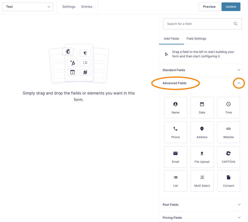 The most common fields used are: Name, Date, Phone, Address, Email. You can find these on the right side of your screen. Note: If the fields are not showing, click the up and down arrow on the right of the field category name to open the dialog. From here, drag-n-drop the field you want into the left form content area.
Date Field
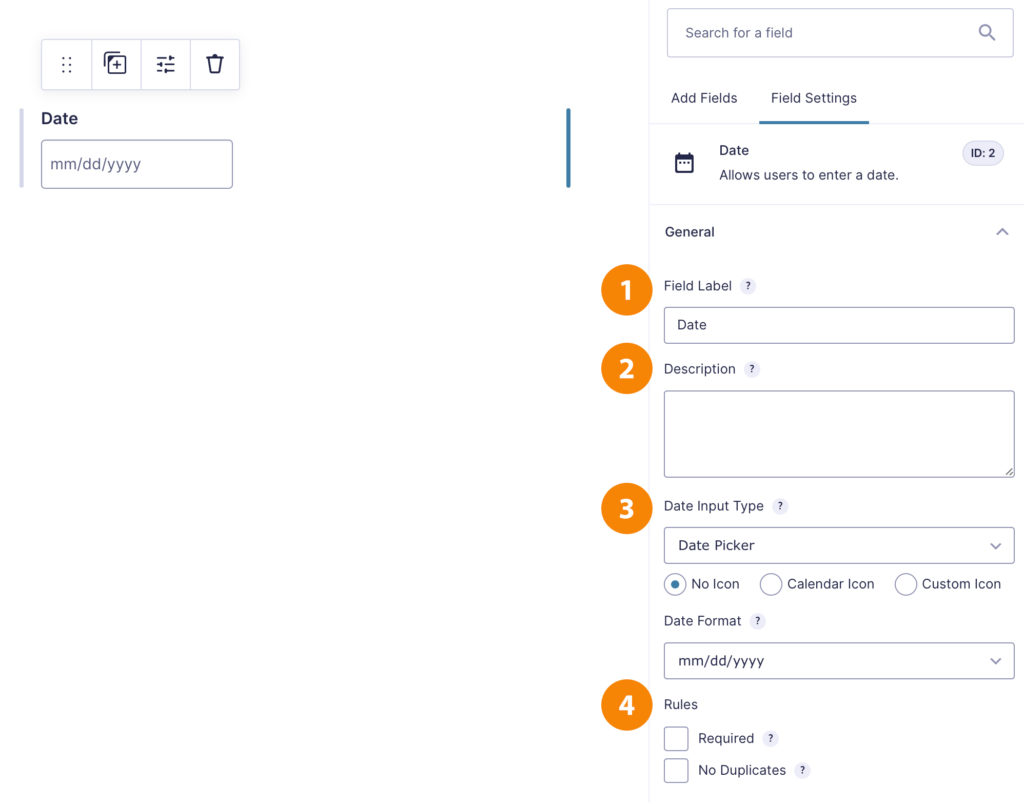
- Field Label: Add a title to your field
- Description: If a description is added, it will appear small below the field box
- Date Input Type: Select to have an icon or not – this allows the user to click on a calendar to chose their date. A small icon will appear next to the field box
- Rules: Select the Required Box if you need this field to be answered before the form is submitted
File Upload Field
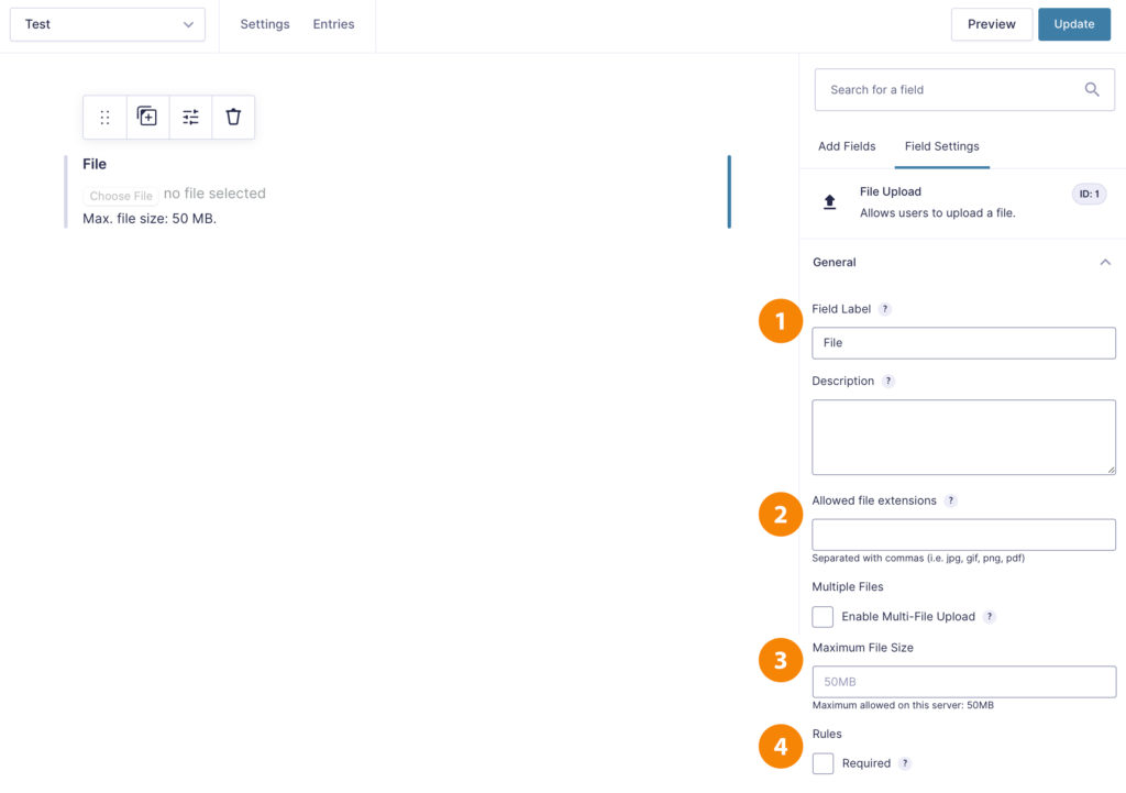
- Field Label: Add a title to your field (example: Upload your resume)
- Allowed File Extensions: You can choose to limit the kinds of files that can be uploaded to only types you can accept, to do this enter the file extensions separated by commas in the box allowed
- Max File Size: You can enter a maximum file size allowed as well
- Rules: Select the Required Box if you need this field to be answered before the form is submitted
Standard Fields
The most common fields used are: Single Line Text, Paragraph Text, Radio Buttons, Checkboxes.
Field Options
-
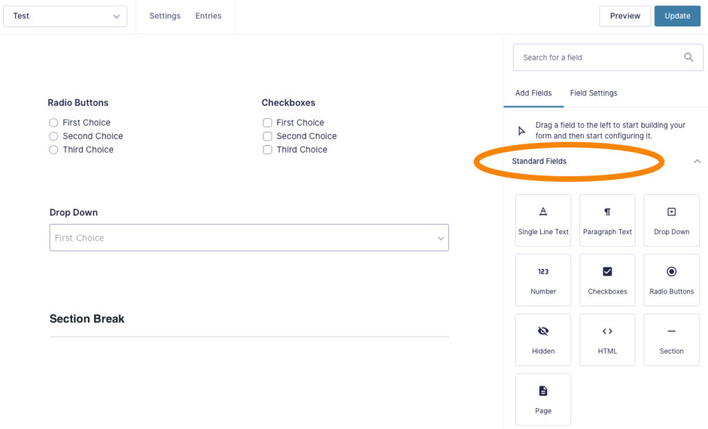
Single Line Text: For any questions you want the user to fill in a word or short sentence.
- Paragraph Text: For any questions you want the user to fill in more than one sentence.
- Radio Buttons: For questions that can only have one choice answers
- Checkboxes: For questions that can have more than one choice answers
- Drop Down: Saves space so that the user has to select one out of the drop down menu
- Number: Allows you to have user enter a number or currency amount. You can set the range of minimum and maximum amounts to be entered. You can also enable calculations if they need to add multiple number fields.
- HTML: This is a content placeholder. It can be used to for content such as a disclaimer or directions that don’t require a field to be answered.
- Page Break: This allows the form to be broken up so the user only sees one page at a time
- Section Break: This allows a line to be added to dived sections of a page
Post Fields
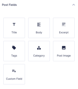 Post fields are used only for posts. You are able to manage the following fields:
- Title
- Body
- Excerpt
- Category
- Image
- Custom Field
Pricing Fields
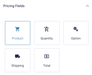 Pricing fields are used for product pages. You are able to manage the following fields:
- Product: Use Drop down, radio buttons or checkboxes for each product with price
- Quantity: for each product
- Option: Use Drop down, radio buttons or checkboxes for each option with price
- Shipping: Add shipping fees to your form
- Total: Add a total button to your form